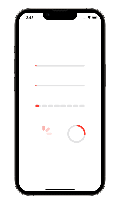
A number of preset progress indicators created with SwiftUI
[](https://swiftpackageindex.com/exyte/ProgressIndicatorView)
[](https://swiftpackageindex.com/exyte/ProgressIndicatorView)
[](https://swiftpackageindex.com/exyte/ProgressIndicatorView)
[](https://cocoapods.org/pods/ProgressIndicatorView)
[](https://github.com/Carthage/Carthage)
[](https://opensource.org/licenses/MIT)
# Usage
Create a progress indicator like this:
```swift
ProgressIndicatorView(isVisible: $showProgressIndicator, type: .bar(progress: $progress))
```
where
`showProgressIndicator` - bool value you may change to display or hide the indicator
`type` - value from `ProgressIndicatorView.IndicatorType` enum
You may alter it with standard SwiftUI means like this:
```swift
ProgressIndicatorView(isVisible: $showProgressIndicator, type: .bar(progress: $progress))
.frame(width: 50.0, height: 50.0)
.foregroundColor(.red)
```
### Indicator types
`default` - progress indicator looks like default iOS UIActivityIndicator.
`bar` - line progress bar with a Binding progress value and background color, default is `Color.clear`:
```swift
ProgressIndicatorView(isVisible: $showProgressIndicator, type: .bar(progress: $progress, backgroundColor: .gray)
.frame(height: 8.0)
.foregroundColor(.red)
```
`impulseBar` - impulse line bar, works as `bar` indicator with an impulse effect.
`dashBar` - discrete line bar, with number of pieces, default is 8:
```swift
ProgressIndicatorView(isVisible: $showProgressIndicator, type: .dashBar(progress: $progress, numberOfItems: 8))
.frame(height: 8.0)
.foregroundColor(.red)
```
`circle` - cirle progress indicator, with `lineWidth` and `strokeColor`:
```swift
ProgressIndicatorView(isVisible: $showProgressIndicator, type: .circle(progress: $progress, lineWidth: 8.0, strokeColor: .red))
.frame(height: 8.0)
.foregroundColor(.red)
```
## Examples
To try out the ProgressIndicatorView examples:
- Clone the repo `git clone git@github.com:exyte/ProgressIndicatorView.git`
- Open terminal and run `cd /Example`
- Run `pod install` to install all dependencies
- Run `xed .` to open project in the Xcode
- Try it!
## Installation
### Swift Package Manager
```swift
dependencies: [
.package(url: "https://github.com/exyte/ProgressIndicatorView.git", from: "0.0.1")
]
```
### CocoaPods
```ruby
pod 'ProgressIndicatorView'
```
### Carthage
```ogdl
github "Exyte/ProgressIndicatorView"
```
## Requirements
* iOS 13+ / watchOS 6+ / tvOS 13+ / macOS 10.15+
* Xcode 11+
## Our other open source SwiftUI libraries
[PopupView](https://github.com/exyte/PopupView) - Toasts and popups library
[Grid](https://github.com/exyte/Grid) - The most powerful Grid container
[ScalingHeaderScrollView](https://github.com/exyte/ScalingHeaderScrollView) - A scroll view with a sticky header which shrinks as you scroll
[AnimatedTabBar](https://github.com/exyte/AnimatedTabBar) - A tabbar with number of preset animations
[MediaPicker](https://github.com/exyte/mediapicker) - Customizable media picker
[Chat](https://github.com/exyte/chat) - Chat UI framework with fully customizable message cells, input view, and a built-in media picker
[ConcentricOnboarding](https://github.com/exyte/ConcentricOnboarding) - Animated onboarding flow
[FloatingButton](https://github.com/exyte/FloatingButton) - Floating button menu
[ActivityIndicatorView](https://github.com/exyte/ActivityIndicatorView) - A number of animated loading indicators
[SVGView](https://github.com/exyte/SVGView) - SVG parser
[LiquidSwipe](https://github.com/exyte/LiquidSwipe) - Liquid navigation animation