 |
|  |
|  |
| -------------------------------------------------------------------------------------------------------------------------- | --------------------------------------------------------------------------------------------------------------------------- | -------------------------------------------------------------------------------------------------------------------------- |
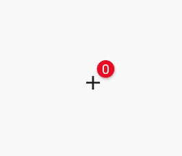
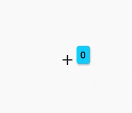
| `BadgeAnimationType.slide` | `BadgeAnimationType.scale` | `BadgeAnimationType.fade` |
|
| -------------------------------------------------------------------------------------------------------------------------- | --------------------------------------------------------------------------------------------------------------------------- | -------------------------------------------------------------------------------------------------------------------------- |
| `BadgeAnimationType.slide` | `BadgeAnimationType.scale` | `BadgeAnimationType.fade` |
 ```dart
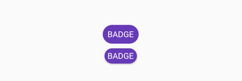
Chip(
padding: EdgeInsets.all(0),
backgroundColor: Colors.deepPurple,
label: Text('BADGE', style: TextStyle(color: Colors.white)),
),
Badge(
toAnimate: false,
shape: BadgeShape.square,
badgeColor: Colors.deepPurple,
borderRadius: BorderRadius.circular(8),
badgeContent: Text('BADGE', style: TextStyle(color: Colors.white)),
),
```
## Custom Usage
There are several options that allow for more control:
| Properties | Description |
| ----------------------------------- | ------------------------------------------------------------------------------------------------------------------------------------------------------------------------------------------------------------------------------------------------------------------------------------------------------------------- |
| `Widget badgeContent` | The content of badge. Usually `Text` or `Icon`. |
| `Color badgeColor` | Background color of the badge. |
| `Widget child` | The main widget. By default it's below the red badge. Usually `Icon`, `IconButton`, `Text` or button. |
| `double elevation` | Shadow of the badge. |
| `Gradient gradient` | Gradient color for the badge content. |
| `bool toAnimate` | Whether animate badge when badge content changed or not. |
| `BadgePosition position` | Can be one of `BadgePosition.topStart()`, `BadgePosition.topEnd()`, `BadgePosition.bottomStart()`, `BadgePosition.bottomEnd()`. Sometimes you want to create unique badge position or create new one manually. For this use `BadgePosition.topEnd(top: -12, end: -20)` or `BadgePosition(start, top, end, bottom)`. |
| `BadgeShape shape` | `BadgeShape.circle` or `BadgeShape.square`. You can use `borderRadius` to change border radius of badge of you use square `BadgeShape.square`. |
| `BorderRadiusGeometry borderRadius` | Border radius of badge. Applies only if `BadgeShape.square` is used. |
| `EdgeInsetsGeometry padding` | The padding of badge content. |
| `Duration animationDuration` | The duration of badge animation when badge content is changed. |
| `BadgeAnimationType animationType` | Can be one of `BadgeAnimationType.slide`, `BadgeAnimationType.scale` or `BadgeAnimationType.fade`. |
| `bool showBadge` | Hide or show badge with animation using bool flag. |
| `AlignmentGeometry alignment` | Alignment of the whole widget |
| `bool ignorePointer` | Enable or disable (default) ignore pointer option |
| `BorderSide borderSide` | Adds a border to the badge |
```dart
Chip(
padding: EdgeInsets.all(0),
backgroundColor: Colors.deepPurple,
label: Text('BADGE', style: TextStyle(color: Colors.white)),
),
Badge(
toAnimate: false,
shape: BadgeShape.square,
badgeColor: Colors.deepPurple,
borderRadius: BorderRadius.circular(8),
badgeContent: Text('BADGE', style: TextStyle(color: Colors.white)),
),
```
## Custom Usage
There are several options that allow for more control:
| Properties | Description |
| ----------------------------------- | ------------------------------------------------------------------------------------------------------------------------------------------------------------------------------------------------------------------------------------------------------------------------------------------------------------------- |
| `Widget badgeContent` | The content of badge. Usually `Text` or `Icon`. |
| `Color badgeColor` | Background color of the badge. |
| `Widget child` | The main widget. By default it's below the red badge. Usually `Icon`, `IconButton`, `Text` or button. |
| `double elevation` | Shadow of the badge. |
| `Gradient gradient` | Gradient color for the badge content. |
| `bool toAnimate` | Whether animate badge when badge content changed or not. |
| `BadgePosition position` | Can be one of `BadgePosition.topStart()`, `BadgePosition.topEnd()`, `BadgePosition.bottomStart()`, `BadgePosition.bottomEnd()`. Sometimes you want to create unique badge position or create new one manually. For this use `BadgePosition.topEnd(top: -12, end: -20)` or `BadgePosition(start, top, end, bottom)`. |
| `BadgeShape shape` | `BadgeShape.circle` or `BadgeShape.square`. You can use `borderRadius` to change border radius of badge of you use square `BadgeShape.square`. |
| `BorderRadiusGeometry borderRadius` | Border radius of badge. Applies only if `BadgeShape.square` is used. |
| `EdgeInsetsGeometry padding` | The padding of badge content. |
| `Duration animationDuration` | The duration of badge animation when badge content is changed. |
| `BadgeAnimationType animationType` | Can be one of `BadgeAnimationType.slide`, `BadgeAnimationType.scale` or `BadgeAnimationType.fade`. |
| `bool showBadge` | Hide or show badge with animation using bool flag. |
| `AlignmentGeometry alignment` | Alignment of the whole widget |
| `bool ignorePointer` | Enable or disable (default) ignore pointer option |
| `BorderSide borderSide` | Adds a border to the badge |