# ColorUICss
**Repository Path**: sysdzw/ColorUI
## Basic Information
- **Project Name**: ColorUICss
- **Description**: 鲜亮的高饱和色彩,ColorUICss是一个Css类的UI组件库!不是一个Js框架。--- 一个基于 ColorUI 的css版本
- **Primary Language**: CSS
- **License**: MIT
- **Default Branch**: master
- **Homepage**: None
- **GVP Project**: No
## Statistics
- **Stars**: 0
- **Forks**: 7
- **Created**: 2023-04-28
- **Last Updated**: 2023-04-28
## Categories & Tags
**Categories**: Uncategorized
**Tags**: None
## README
大部分代码基于[ColorUI](https://github.com/weilanwl/ColorUI "ColorUI") 修改而来,ColorUI目前只针对微信小程序,本项目ColorUICss时非常纯粹的移动端CSS。 ColorUICss专注于移动端Css框架。初衷主要是要一个纯粹的移动端CSS框架,由于多用于VUE框架中, 基于VUE的框架也有很多优秀的,但往往我只需要其中一个组件,这个时候个项目就会显得很杂乱, 于是就写个纯粹的CSS。
交流QQ群:837450231
感谢[ColorUI](https://github.com/weilanwl/ColorUI "ColorUI") 作者,很喜欢这样的色彩搭配。
[手机演示](http://anyhome.gitee.io/colorui/ "http://anyhome.gitee.io/colorui/")
[](https://oscimg.oschina.net/oscnet/2d28d0b43f531ccb2edad7e31367676a61d.jpg)
- 演示安装
```bash
git clone https://gitee.com/anyhome/ColorUI.git
cd ColorUI
npm install
npm run serve
```
**浏览地址 http://localhost:9003/colorui/**
## 基础
1. 布局
2. 背景
3. 文本
4. 图标
5. 按钮
6. 标签
7. 头像
8. 进度条
9. 边框阴影
10. 加载
## 组件
1. 操作条
2. 导航栏
3. 列表
4. 卡片
5. 输入框 6.复选框 7.单选框 8.开关
6. 时间轴
7. 聊天
8. 轮播
9. 模态框
10. 步骤条
# 概述
ColorUICss专注于移动端Css框架,主要用于在VUE框架中弥补某些小功能、小组件的不足之处,ColorUICss只是一个纯粹的移动端CSS。
多处采用 **tien-** 作为命名空间而不是所有地方,是为了再不影响其他css命名冲突的前提下,一些常用的组件又不至于书写麻烦。组件的命名空间后期可能还会继续更新。
# 布局
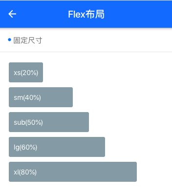
## 固定尺寸
采用flex弹性布局,安装宽带百分比显示,例如显示20%宽度。
```html
```
```css
.flex {
display: flex;
}
.flex-wrap {
flex-wrap: wrap;
}
.flex-20 {
flex-basis: 20%;
}
.flex-40 {
flex-basis: 40%;
}
.flex-50 {
flex-basis: 50%;
}
.flex-60 {
flex-basis: 60%;
}
.flex-80 {
flex-basis: 80%;
}
```
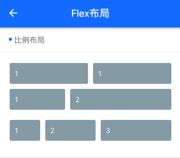
## 比例布局
```html
```
```css
.flex {
display: flex;
}
.flex-1 {
flex: 1;
}
.flex-2 {
flex: 2;
}
```
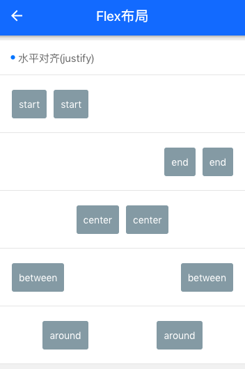
- 水平对齐 justify
```html
```
```css
.justify-start {
justify-content: flex-start;
}
.justify-end {
justify-content: flex-end;
}
.justify-center {
justify-content: center;
}
.justify-between {
justify-content: space-between;
}
.justify-around {
justify-content: space-around;
}
```
- 垂直对齐 align
```html
```
```css
.align-start {
align-items: flex-start;
}
.align-end {
align-items: flex-end;
}
.align-center {
align-items: center;
}
.align-stretch {
align-items: stretch;
}
.align-stretch {
align-items: stretch;
}
```
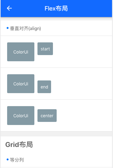
## Grid布局
整个分10列,和我们通常使用的btcss还不太一样,比如
```html
```
当我们要实现4列布局时,需要加外层 grid col-4,自动将内层tien-col等分。

- 等高
```html
```
```css
.grid.grid-square {
overflow: hidden;
}
```
## 辅助布局
- 边距
margin-no 所有外边距为 0px
margin-5 所有外边距为5px,其他还有 margin-10、margin-15、margin-20、margin-25
margin-top-no 外上边距为 0 px,其他还有 margin-top-5、margin-top-10、margin-top-15、margin-top-20、margin-top-25
类似的还有左边距 margin-left、右边距margin-right、下边距margin-bottom。
内边距以此类推。如 padding-no、padding-5、padding-10
默认margin、padding 为 15px;
```html
{size}的尺寸有xs/sm/df/lg/xl
外边距
内边距
.margin-{size}
.padding-{size}
水平方向外边距
水平方向内边距
.margin-lr-{size}
.padding-lr-{size}
垂直方向外边距
垂直方向内边距
.margin-tb-{size}
.padding-tb-{size}
上外边距
上内边距
.margin-top-{size}
.padding-top-{size}
右外边距
右内边距
.margin-right-{size}
.padding-right-{size}
下外边距
下内边距
margin-bottom-{size}
.padding-bottom-{size}
左外边距
左内边距
.margin-left-{size}
.padding-left-{size}
```
- 圆角和浮动
```css
//默认圆角
.radius {
border-radius: 3px;
}
//宽度100%
.response {
width: 100%;
}
/* -- 浮动 -- */
.cf::after, .cf::before,.clear::after, .clear::before {
content: " ";
display: table;
}
.cf::after,.clear::after {
clear: both;
}
.fl {
float: left;
}
.fr {
float: right;
}
```
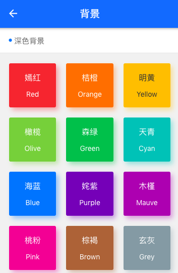
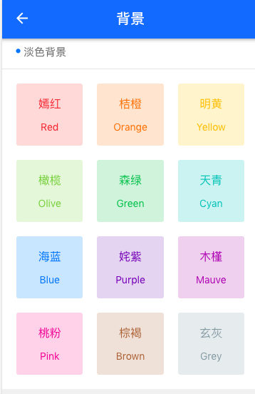
# 背景
背景以bg-前缀,例如红色背景bg-red,其他还有.bg-red、.bg-orange、.bg-yellow、.bg-olive、.bg-green、.bg-cyan、.bg-blue、.bg-purple、.bg-mauve、.bg-pink、.bg-brown、.bg-grey、.bg-gray、.bg-black、.bg-white。加上 .light 则是相对应的浅色背景
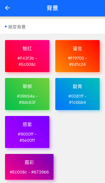
- 渐变背景
```html
```
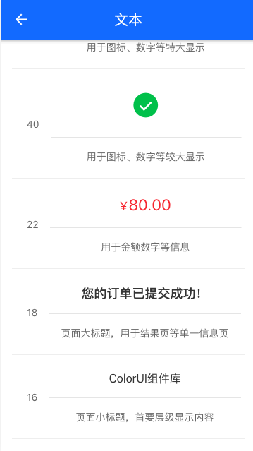
# 文本
- 文字大小
```css
.text-10 {
font-size: 10px;
}
.text-12 {
font-size: 12px;
}
.text-14 {
font-size: 14px;
}
.text-16 {
font-size: 16px;
}
.text-18 {
font-size: 18px;
}
.text-22 {
font-size: 22px;
}
.text-40 {
font-size: 40px;
}
.text-60 {
font-size: 60px;
}
//首字母大写
.text-Abc {
text-transform: Capitalize;
}
//字母全部大写
.text-ABC {
text-transform: Uppercase;
}
//字母全部小写
.text-abc {
text-transform: Lowercase;
}
//字符截断
.text-cut {
text-overflow: ellipsis;
white-space: nowrap;
overflow: hidden;
}
//粗体
.text-bold {
font-weight: bold;
}
```
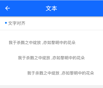
- 文字对齐
```css
//居中
.text-center {
text-align: center;
}
//行高
.text-content {
line-height: 1.6;
}
//左对齐
.text-left {
text-align: left;
}
//右对齐
.text-right {
text-align: right;
}
```
文字颜色
```css
.text-red, .line-red, .lines-red {
color: #e54d42;
}
.text-orange, .line-orange, .lines-orange {
color: #f37b1d;
}
.text-yellow, .line-yellow, .lines-yellow {
color: #fbbd08;
}
.text-olive, .line-olive, .lines-olive {
color: #8dc63f;
}
.text-green, .line-green, .lines-green {
color: #39b54a;
}
.text-cyan, .line-cyan, .lines-cyan {
color: #1cbbb4;
}
.text-blue, .line-blue, .lines-blue {
color: #0081ff;
}
.text-purple, .line-purple, .lines-purple {
color: #6739b6;
}
.text-mauve, .line-mauve, .lines-mauve {
color: #9c26b0;
}
.text-pink, .line-pink, .lines-pink {
color: #e03997;
}
.text-brown, .line-brown, .lines-brown {
color: #a5673f;
}
.text-grey, .line-grey, .lines-grey {
color: #8799a3;
}
.text-gray, .line-gray, .lines-gray {
color: #aaa;
}
.text-black, .line-black, .lines-black {
color: #333;
}
.text-white, .line-white, .lines-white {
color: #fff;
}
```

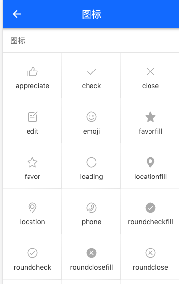
# 图标
图标使用阿里云 iconfont图标,为不和自己的图标冲突使用tien-前缀,例如 .tien-icon-fork
```css
[class*="tien-icon-"] {
font-family: "iconfont" !important;
font-size: inherit;
font-style: normal;
}
```
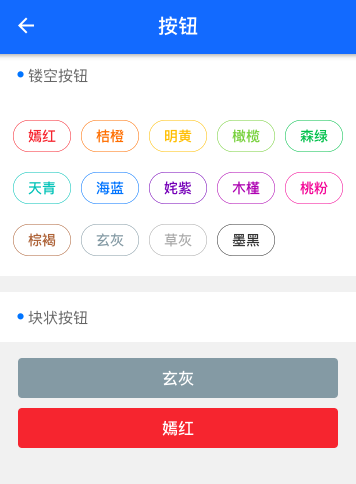
# 按钮
- 形状、尺寸、颜色
颜色请参考背景颜色
```html
```
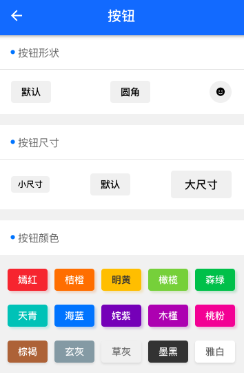
镂空按钮只需要加 .line-[背景色],块状按钮加 .lg
# 标签
- 形状、尺寸、颜色
```html
默认
椭圆
圆角
小尺寸
普通尺寸
颜色则加 bg-[背景色] 例如 bg-red 参考背景色
```
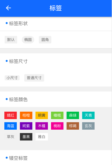
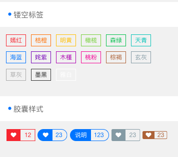
- 样式
镂空加 line-[背景色] 例如 bg-red 参考背景色。胶囊样式
```html
```
如果本项目对您有帮助请给我点动力^_^