# EasyTipView
**Repository Path**: wfrobin/EasyTipView
## Basic Information
- **Project Name**: EasyTipView
- **Description**: No description available
- **Primary Language**: Unknown
- **License**: MIT
- **Default Branch**: master
- **Homepage**: None
- **GVP Project**: No
## Statistics
- **Stars**: 0
- **Forks**: 0
- **Created**: 2024-11-01
- **Last Updated**: 2024-11-01
## Categories & Tags
**Categories**: Uncategorized
**Tags**: None
## README
[](http://cocoapods.org/pods/EasyTipView)
[](https://travis-ci.org/teodorpatras/EasyTipView)
[](http://cocoapods.org/pods/EasyTipView)
[](https://github.com/Carthage/Carthage)
[](http://cocoapods.org/pods/EasyTipView)
Description
--------------
```EasyTipView``` is a fully customizable tooltip view written in Swift that can be used as a call to action or informative tip.
|

[](http://cocoapods.org/pods/EasyTipView)
[](https://travis-ci.org/teodorpatras/EasyTipView)
[](http://cocoapods.org/pods/EasyTipView)
[](https://github.com/Carthage/Carthage)
[](http://cocoapods.org/pods/EasyTipView)
Description
--------------
```EasyTipView``` is a fully customizable tooltip view written in Swift that can be used as a call to action or informative tip.
| |
| |
|----------|-------------|
# Contents
1. [Features](#features)
3. [Installation](#installation)
4. [Supported OS & SDK versions](#supported-versions)
5. [Usage](#usage)
6. [Customizing the appearance](#customising)
7. [Customising the presentation and dismissal animations](#customising-animations)
8. [License](#license)
9. [Contact](#contact)
Features
--------------
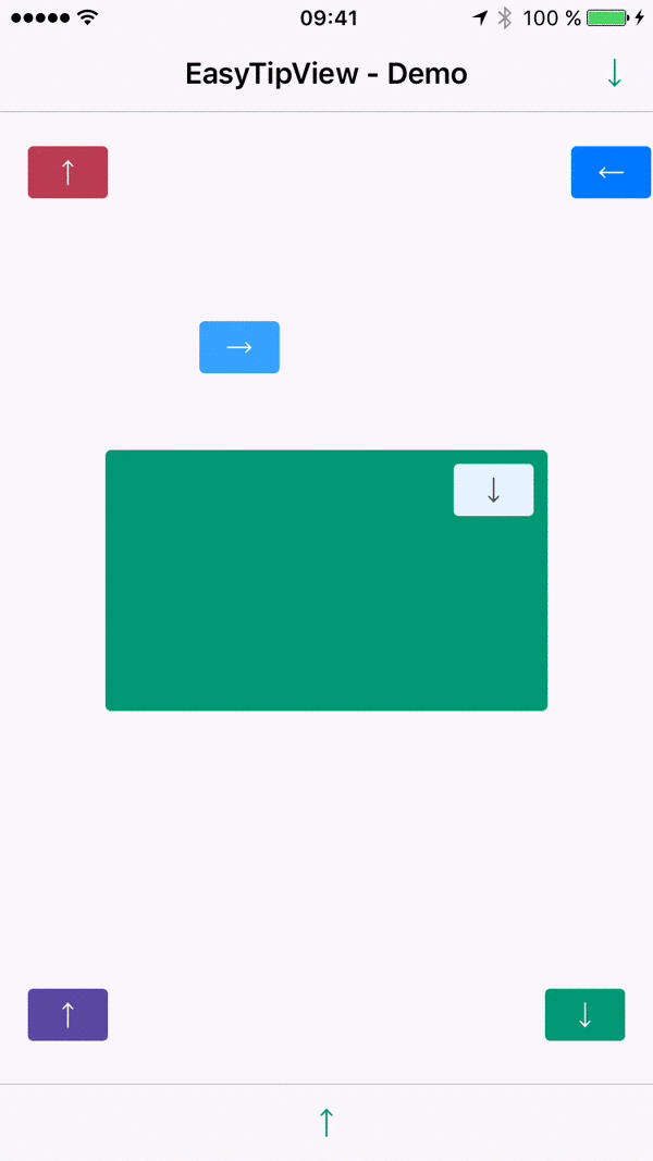
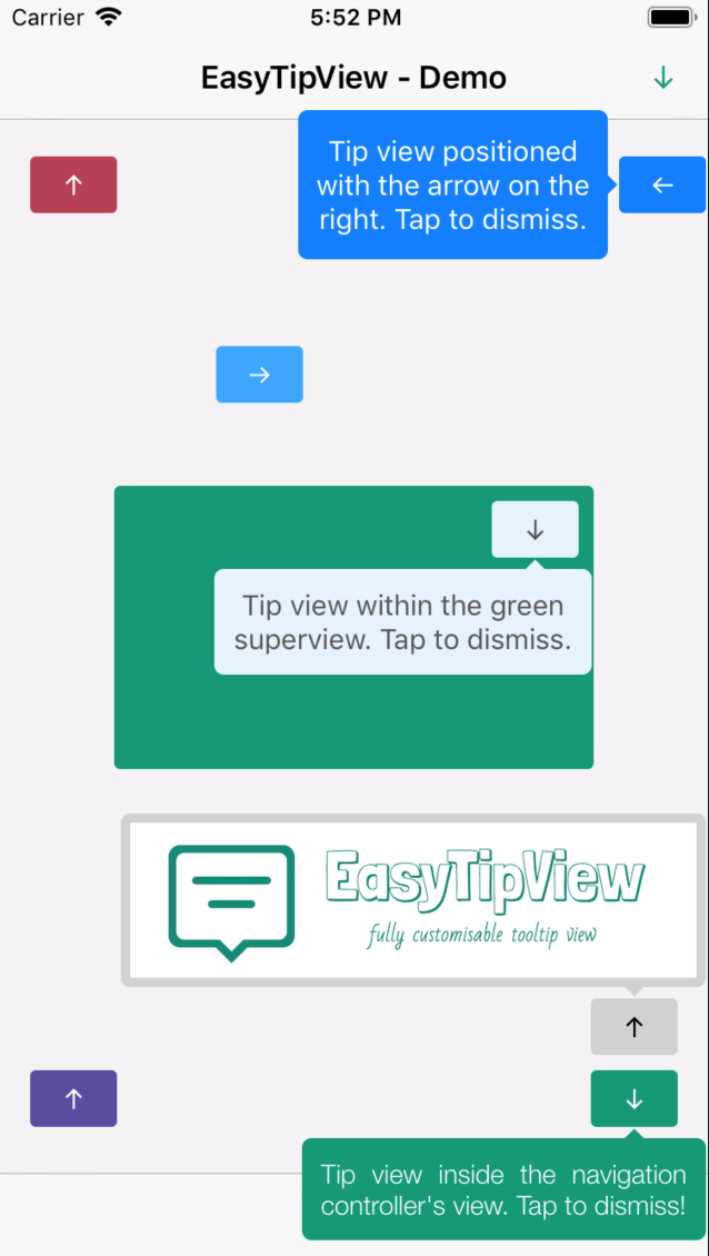
- [x] Can be shown pointing to any ``UIBarItem`` or ``UIView`` subclass.
- [x] Support for any arrow direction `←, →, ↑, ↓`
- [x] Automatic orientation change adjustments.
- [x] Fully customizable appearance (custom content view or simply just text - including `NSAttributedString` - see the Example app).
- [x] Fully customizable presentation and dismissal animations.
Installation
--------------
### CocoaPods
[CocoaPods](http://cocoapods.org) is a dependency manager for Cocoa projects.
CocoaPods 0.36 adds supports for Swift and embedded frameworks. You can install it with the following command:
```bash
$ gem install cocoapods
```
To integrate EasyTipView into your Xcode project using CocoaPods, specify it in your `Podfile`:
```ruby
pod 'EasyTipView', '~> 2.1'
```
Then, run the following command:
```bash
$ pod install
```
In case Xcode complains ("Cannot load underlying module for EasyTipView") go to Product and choose Clean (or simply press ⇧⌘K).
### Carthage
[Carthage](https://github.com/Carthage/Carthage) is a decentralized dependency manager that builds your dependencies and provides you with binary frameworks.
You can install Carthage with [Homebrew](http://brew.sh/) using the following command:
```bash
$ brew update
$ brew install carthage
```
To integrate EasyTipView into your Xcode project using Carthage, specify it in your `Cartfile`:
```ogdl
github "teodorpatras/EasyTipView"
```
Run `carthage update` to build the framework and drag the built `EasyTipView.framework` into your Xcode project.
### Manually
If you prefer not to use either of the aforementioned dependency managers, you can integrate EasyTipView into your project manually.
Supported OS & SDK Versions
-----------------------------
* Supported build target - iOS 8+ (Xcode 8)
Usage
--------------
1) First you should customize the preferences:
```swift
var preferences = EasyTipView.Preferences()
preferences.drawing.font = UIFont(name: "Futura-Medium", size: 13)!
preferences.drawing.foregroundColor = UIColor.whiteColor()
preferences.drawing.backgroundColor = UIColor(hue:0.46, saturation:0.99, brightness:0.6, alpha:1)
preferences.drawing.arrowPosition = EasyTipView.ArrowPosition.top
/*
* Optionally you can make these preferences global for all future EasyTipViews
*/
EasyTipView.globalPreferences = preferences
```
2) Secondly call the ``show(animated: forView: withinSuperview: text: preferences: delegate:)`` method:
```swift
EasyTipView.show(forView: self.buttonB,
withinSuperview: self.navigationController?.view,
text: "Tip view inside the navigation controller's view. Tap to dismiss!",
preferences: preferences,
delegate: self)
```
**Note that if you set the** ```EasyTipView.globalPreferences```**, you can ommit the** ```preferences``` **parameter in all calls. Additionally, you can also ommit the** ``withinSuperview`` **parameter and the** ``EasyTipView`` **will be shown within the main application window**.
*Alternatively, if you want to dismiss the ``EasyTipView`` programmatically later on, you can use one of the instance methods:*
```swift
let tipView = EasyTipView(text: "Some text", preferences: preferences)
tipView.show(forView: someView, withinSuperview: someSuperview)
// later on you can dismiss it
tipView.dismiss()
```
Customizing the appearance
--------------
In order to customize the `EasyTipView` appearance and behavior, you can play with the `Preferences` structure which encapsulates all the customizable properties of the ``EasyTipView``. These preferences have been split into three structures:
* ```Drawing``` - encapsulates customizable properties specifying how ```EastTipView``` will be drawn on screen.
* ```Positioning``` - encapsulates customizable properties specifying where ```EasyTipView``` will be drawn within its own bounds.
* ```Animating``` - encapsulates customizable properties specifying how ```EasyTipView``` will animate on and off screen.
| `Drawing ` attribute | Description |
|----------|-------------|
|`cornerRadius`| The corner radius of the tip view bubble.|
|`arrowHeight`| The height of the arrow positioned at the top or bottom of the bubble.|
|`arrowWidth`| The width of the above mentioned arrow.|
|`foregroundColor`| The text color.|
|`backgroundColor`| The background color of the bubble.|
|`arrowPosition`| The position of the arrow. This can be:
|
|----------|-------------|
# Contents
1. [Features](#features)
3. [Installation](#installation)
4. [Supported OS & SDK versions](#supported-versions)
5. [Usage](#usage)
6. [Customizing the appearance](#customising)
7. [Customising the presentation and dismissal animations](#customising-animations)
8. [License](#license)
9. [Contact](#contact)
Features
--------------
- [x] Can be shown pointing to any ``UIBarItem`` or ``UIView`` subclass.
- [x] Support for any arrow direction `←, →, ↑, ↓`
- [x] Automatic orientation change adjustments.
- [x] Fully customizable appearance (custom content view or simply just text - including `NSAttributedString` - see the Example app).
- [x] Fully customizable presentation and dismissal animations.
Installation
--------------
### CocoaPods
[CocoaPods](http://cocoapods.org) is a dependency manager for Cocoa projects.
CocoaPods 0.36 adds supports for Swift and embedded frameworks. You can install it with the following command:
```bash
$ gem install cocoapods
```
To integrate EasyTipView into your Xcode project using CocoaPods, specify it in your `Podfile`:
```ruby
pod 'EasyTipView', '~> 2.1'
```
Then, run the following command:
```bash
$ pod install
```
In case Xcode complains ("Cannot load underlying module for EasyTipView") go to Product and choose Clean (or simply press ⇧⌘K).
### Carthage
[Carthage](https://github.com/Carthage/Carthage) is a decentralized dependency manager that builds your dependencies and provides you with binary frameworks.
You can install Carthage with [Homebrew](http://brew.sh/) using the following command:
```bash
$ brew update
$ brew install carthage
```
To integrate EasyTipView into your Xcode project using Carthage, specify it in your `Cartfile`:
```ogdl
github "teodorpatras/EasyTipView"
```
Run `carthage update` to build the framework and drag the built `EasyTipView.framework` into your Xcode project.
### Manually
If you prefer not to use either of the aforementioned dependency managers, you can integrate EasyTipView into your project manually.
Supported OS & SDK Versions
-----------------------------
* Supported build target - iOS 8+ (Xcode 8)
Usage
--------------
1) First you should customize the preferences:
```swift
var preferences = EasyTipView.Preferences()
preferences.drawing.font = UIFont(name: "Futura-Medium", size: 13)!
preferences.drawing.foregroundColor = UIColor.whiteColor()
preferences.drawing.backgroundColor = UIColor(hue:0.46, saturation:0.99, brightness:0.6, alpha:1)
preferences.drawing.arrowPosition = EasyTipView.ArrowPosition.top
/*
* Optionally you can make these preferences global for all future EasyTipViews
*/
EasyTipView.globalPreferences = preferences
```
2) Secondly call the ``show(animated: forView: withinSuperview: text: preferences: delegate:)`` method:
```swift
EasyTipView.show(forView: self.buttonB,
withinSuperview: self.navigationController?.view,
text: "Tip view inside the navigation controller's view. Tap to dismiss!",
preferences: preferences,
delegate: self)
```
**Note that if you set the** ```EasyTipView.globalPreferences```**, you can ommit the** ```preferences``` **parameter in all calls. Additionally, you can also ommit the** ``withinSuperview`` **parameter and the** ``EasyTipView`` **will be shown within the main application window**.
*Alternatively, if you want to dismiss the ``EasyTipView`` programmatically later on, you can use one of the instance methods:*
```swift
let tipView = EasyTipView(text: "Some text", preferences: preferences)
tipView.show(forView: someView, withinSuperview: someSuperview)
// later on you can dismiss it
tipView.dismiss()
```
Customizing the appearance
--------------
In order to customize the `EasyTipView` appearance and behavior, you can play with the `Preferences` structure which encapsulates all the customizable properties of the ``EasyTipView``. These preferences have been split into three structures:
* ```Drawing``` - encapsulates customizable properties specifying how ```EastTipView``` will be drawn on screen.
* ```Positioning``` - encapsulates customizable properties specifying where ```EasyTipView``` will be drawn within its own bounds.
* ```Animating``` - encapsulates customizable properties specifying how ```EasyTipView``` will animate on and off screen.
| `Drawing ` attribute | Description |
|----------|-------------|
|`cornerRadius`| The corner radius of the tip view bubble.|
|`arrowHeight`| The height of the arrow positioned at the top or bottom of the bubble.|
|`arrowWidth`| The width of the above mentioned arrow.|
|`foregroundColor`| The text color.|
|`backgroundColor`| The background color of the bubble.|
|`arrowPosition`| The position of the arrow. This can be:
**+** `.top`: on top of the bubble
**+** `.bottom`: at the bottom of the bubble.
**+** `.left`: on the left of the bubble
**+** `.right`: on the right of the bubble
**+** `.any`: use this option to let the `EasyTipView` automatically find the best arrow position.
**If the passed in arrow cannot be applied due to layout restrictions, a different arrow position will be automatically assigned.**|
|`textAlignment`| The alignment of the text.|
|`borderWidth`| Width of the optional border to be applied on the bubble.|
|`borderColor`| Color of the optional border to be applied on the bubble. **In order for the border to be applied, `borderColor` needs to be different that `UIColor.clear` and `borderWidth` > 0**|
|`font`| Font to be applied on the text. |
|`shadowColor`| The color of the shadow (default `UIColor.clearcolor`).|
|`shadowOpacity`| The opacity of the shadow (default `0`). **For the shadow to be drawn, both** `shadowColor` **and** `shadowOpacity` **must be set to a valid value.**|
|`shadowRadius`| The radius of the shadow (default `0`).|
|`shadowOffset` | The offset of the shadow. |
| `Positioning ` attribute | Description |
|----------|-------------|
|`bubbleHInset`| Horizontal bubble inset within its container.|
|`bubbleVInset`| Vertical bubble inset within its container.|
|`contentHInset`| Content horizontal inset within the bubble.|
|`contentVInset`| Content vertical inset within the bubble.|
|`maxWidth`| Max bubble width.|
| `Animating ` attribute | Description |
|----------|-------------|
|`dismissTransform`| `CGAffineTransform` specifying how the bubble will be dismissed. |
|`showInitialTransform`| `CGAffineTransform` specifying the initial transform to be applied on the bubble before it is animated on screen. |
|`showFinalTransform`| `CGAffineTransform` specifying how the bubble will be animated on screen. |
|`springDamping`| Spring animation damping.|
|`springVelocity`| Spring animation velocity.|
|`showInitialAlpha`|Initial alpha to be applied on the tip view before it is animated on screen.|
|`dismissFinalAlpha`|The alpha to be applied on the tip view when it is animating off screen.|
|`showDuration`|Show animation duration.|
|`dismissDuration`|Dismiss animation duration.|
|`dismissOnTap`|Prevents view from dismissing on tap if it is set to false. (Default value is true.)|
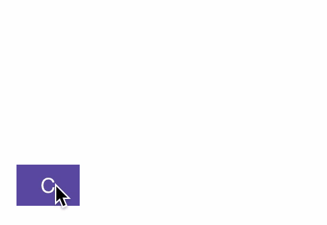
Customising the presentation or dismissal animations
--------------
The default animations for showing or dismissing are scale up and down. If you want to change the default behavior, you need to change the attributes of the ``animating`` property within the preferences. An example could be:
```swift
preferences.animating.dismissTransform = CGAffineTransform(translationX: 0, y: -15)
preferences.animating.showInitialTransform = CGAffineTransform(translationX: 0, y: -15)
preferences.animating.showInitialAlpha = 0
preferences.animating.showDuration = 1.5
preferences.animating.dismissDuration = 1.5
```
This produces the following animations:
 For more animations, checkout the example project.
*Once you configured the animations, a good idea would be to __make these preferences global__, for all future instances of `EasyTipView` by assigning it to ```EasyTipView.globalPreferences```.*
License
--------------
```EasyTipView``` is developed by [Teodor Patraş](https://www.teodorpatras.com) and is released under the MIT license. See the ```LICENSE``` file for details.
Logo was created using Bud Icons Launch graphic by [Budi Tanrim](http://buditanrim.co) from [FlatIcon](http://www.flaticon.com/) which is licensed under [Creative Commons BY 3.0](http://creativecommons.org/licenses/by/3.0/). Made with [Logo Maker](http://logomakr.com).
Contact
--------------
You can follow or drop me a line on [my Twitter account](https://twitter.com/teodorpatras). If you find any issues on the project, you can open a ticket. Pull requests are also welcome.
For more animations, checkout the example project.
*Once you configured the animations, a good idea would be to __make these preferences global__, for all future instances of `EasyTipView` by assigning it to ```EasyTipView.globalPreferences```.*
License
--------------
```EasyTipView``` is developed by [Teodor Patraş](https://www.teodorpatras.com) and is released under the MIT license. See the ```LICENSE``` file for details.
Logo was created using Bud Icons Launch graphic by [Budi Tanrim](http://buditanrim.co) from [FlatIcon](http://www.flaticon.com/) which is licensed under [Creative Commons BY 3.0](http://creativecommons.org/licenses/by/3.0/). Made with [Logo Maker](http://logomakr.com).
Contact
--------------
You can follow or drop me a line on [my Twitter account](https://twitter.com/teodorpatras). If you find any issues on the project, you can open a ticket. Pull requests are also welcome.